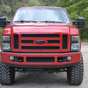
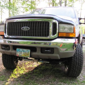
Is it me or does the color scheme...

DSTRBD

New member
Joined
May 18, 2011
Messages
697
Reaction score
0
Location
Houston
And somebody make it so that a google search will return this website. Typing "powerstrokearmy" into google returns a bunch of facebook links but nothing for this site.

Has Google simply not realized this site exists yet?

It might take a few days for google to index it. They are fast, but not that fast.
 

imelmo

Active member
Joined
May 18, 2011
Messages
6,631
Reaction score
2
Not gonna lie, the colors bother the crap out of me, lol.

.
 

Charles

Well-known member
Joined
May 18, 2011
Messages
2,723
Reaction score
30
It's the highs and lows in the horizontal bars. Scroll up and down really quickly while keeping your eyes fixed in one spot on the screen and you'll see them coming by your eye. This is what is confusing your eyes. No question. It looks cool, but with multiple high and low light portions of each one they create a very busy backdrop for your eyes to make sense of. Those horizontal breakers are used to separate posts and everything else on the page. They should be as uniform as possible from a purely functional/human factors standpoint.

But... form plays a role too. Which is why I think a compromise might be to make them solid, the lighter color. They would still be metal, with the brushed look, just without the confusion.
 

powerstrokenstang

New member
Joined
May 18, 2011
Messages
771
Reaction score
0
Location
Verona VA
i am w/ charles the light spots on the bars draw attention from the white writing. other than that i like the colors. haha come to the darkside.
 

Coltaine

New member
Joined
May 18, 2011
Messages
277
Reaction score
0
Location
Aalesund, Norway
heavymetal_example.png


I like the style like this.
 

morepower02

New member
Joined
May 18, 2011
Messages
2,827
Reaction score
0
Location
MN
it's the highs and lows in the horizontal bars. Scroll up and down really quickly while keeping your eyes fixed in one spot on the screen and you'll see them coming by your eye. This is what is confusing your eyes. No question. It looks cool, but with multiple high and low light portions of each one they create a very busy backdrop for your eyes to make sense of.

bingo.
 

ParkerFly

Member
Joined
May 18, 2011
Messages
258
Reaction score
0
Location
McMinnville, TN
It's taking some getting used to but I'm getting there. I like how the different colored fonts stand out against this background though.
 

Latest posts

Members online

No members online now.
Top